
Bryce Canyon under a fresh carpet of snow. Taken in April 2009. One of the most visually compelling places we have ever been.

Bryce Canyon under a fresh carpet of snow. Taken in April 2009. One of the most visually compelling places we have ever been.
Some of my eagle-eyed readers have noticed that I have recently started to add a watermark to some of my images. I thought I would share how I have done this and then ask whether I should have done it at all.

I drew my logo with black pen on white paper and photographed it. In photoshop (I use CS4), I adjusted the exposure to get a true black and true white and then inverted the image, so now I had a white dragonfly on a black background. Then I added the type and the ‘C’ in a new layer and, hey presto, one logo.

Or two logos – I can’t decide which I like better.
To insert into an image, I copy and paste the logo onto the image and then select screen from the drop down menu of layer modes. This ignores the black background and just adds the white. Then I adjust the opacity slider to get a watermark effect.
In the top image, I have coloured the watermark to suit the subject. This is easily done simply by using the paint bucket tool and clicking on the white areas of the logo before you add it to your image. If you choose a dark colour, you may find it works better to invert the logo (back to black on white) before changing the colour by clicking on the black writing and picture and then use multiply as your blending mode, thus losing the white background and pasting only the dark letters.
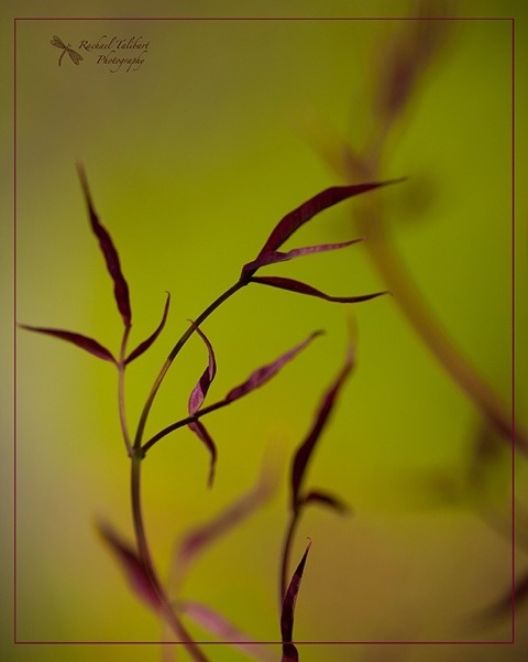
Well, I like my pretty little logos and I had a lot of fun designing them. I was influenced by a couple of friends who have very stylish logos that always look great. See Modern Memory Keeping for a great example. But when I add my shiny new watermarks to my images I feel frustrated as they often seem to me to spoil the look. It’s not too bad in an image like the one at the top, which is as much about design and presentation as the photograph alone, but I have no doubt at all that a watermark would spoil, for me, an image like this:

How important is it to add a watermark when sharing images on the web? Does it really offer a practical protection from image misuse? It does perhaps make sure your shot is attributed to you when reposted by people too lazy to attribute properly. But if you want to stop others from deliberately poaching your work, a little watermark in the margin, so very easily cloned away, isn’t going to help you. You need a dirty great watermark marching right across the middle of your cherished image, thus spoiling its appearance utterly.
What do you think?

“Medicine for the soul”
Inscription over library door in Alexandria (Diodorus Siculus, History, I)
Aren’t books glorious? Quite apart from their contents, they are so wonderfully tactile! Flaubert understood the sensuality of books when he described Emma Bovary’s delight in opening a book: “She shivered as her breath lifted the tissue paper over the engravings, and it curved and half folded and then fell back, softly unfurling” (Madame Bovary, trans.Geoffrey Wall, Penguin Classics, p.35).
Books are also very photogenic. On their own, in rows or in the wonderful multiplicity of a bookshop or library.
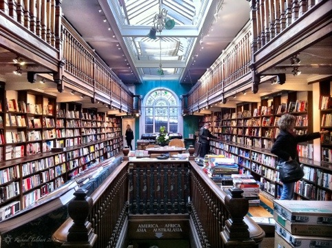
This shot is of a particularly enticing bookshop on Marylebone High Street in London. “The heart of Daunt Books is an original Edwardian bookshop with long oak galleries and graceful skylights. Its soul is the unique arrangement of books by country – where guides, novels and non-fiction of all kinds will interest traveller and browser alike”. (The Daunt Books bookmark.)
You never know what interesting characters you might meet in a second-hand bookshop:

Today’s final shot was taken as I worked on an essay at college. It’s just an iPhone snap but it captures some of the atmosphere of Founders Library, Royal Holloway College, University of London, an eminently suitable place to be studying English literature!

If you can’t get enough of book pictures, try this.

“Fly me to the moon
Let me swing among those stars
Let me see what spring is like
On Jupiter and Mars”
Bart Howard ‘In other words’ (1954)
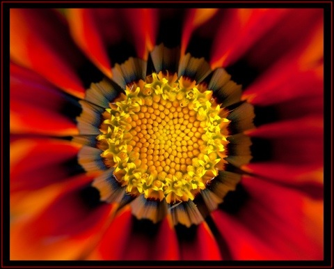
I am a member of a camera club and often enter images in their competitions. One night I entered this image, called “Floral Fireworks”. It did very well, earning me 10 out of 10. The judge was complimentary but she assumed the blurring had been achieved in Photoshop. In fact, this shot was, apart from a small crop and the frame, straight out of camera. The blur is simply the result of using a wide aperture (f2.8) and focusing on the centre of a cup shaped bloom. The petals, being nearer the sensor than the centre, are soft.
I think Photoshop is a powerful and effective tool and I enjoy using it. But I wonder whether it has caused us sometimes to forget what can be achieved in camera? For me, the most powerful tool of all is understanding how my camera works. What do you think?

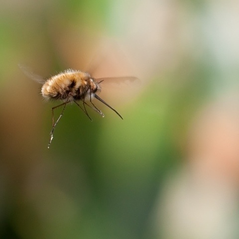
The subject of my natural history post for this week is the bee fly or bombylius major. This bee-mimic is common in my part of the world (Southern England) in early spring.

Its rather imposing appearance can lead people to assume that it is dangerous but it cannot harm you: that long proboscis is merely a very efficient nectar guzzler. In fact, I think the bee fly is rather cute. Just me, perhaps.

They certainly look quite cute on the wing, with their spindly legs flying out Superman style from the chubby body. However, while they may not be harmful to humans, they have a sinister life cycle if you happen to be a bee.

This bee mimic lays its eggs by the nests of solitary bees. When the larva hatches, it uses a crown of spines on its head to batter its way into the cell of the bee pupa and slowly sucks the pupa dry.
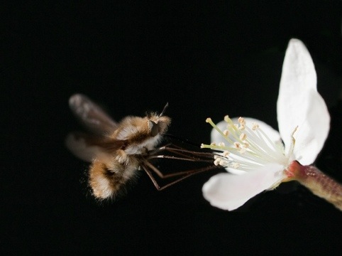
Afterwards, the gorged larva pupates and finally emerges in its final form by battering its way out of the cell.

Needless to say, I have not been able to take photographs of the full life-cycle, just the disingenuously cute, fluffy fly.
For some more (and frankly better) pictures and two poems (yes!) about bee flies, visit my friend Giles Watson’s Flickr photostream. The second poem (which treats the life cycle) appears in a comment there.
PS Some of the images appear pixelated here. They do not in the files I uploaded. If anyone knows what I’m doing wrong, please can you help? It’s a shame for them not to appear their best.

“Hope is a good thing, maybe the best of things, and no good thing ever dies.” Andy Dufresne, The Shawshank Redemption.
I decided to have a go at the Quotography challenge on Nick Exposed. Each participant submitted three quotations. Then they were jumbled up and we were sent three from someone else with the challenge to photograph them. I can’t claim a great deal of success. I only did two of the quotations I received and one of those is best described as developmental. This is the best.
The problem with this quote was that ‘Hope’ as an abstract concept can be represented by almost anything. My team mate, my eleven year-old daughter, and I agreed that we didn’t want to photograph a flower, or a landscape, or any other random thing simply because its beauty might suggest hope. We wanted to represent Hope more specifically. My daughter, a fan of myths and legends, suggested the story of Pandora’s box, in which hope is sometimes described as a white butterfly. I liked the idea of using a living thing to represent hope as it tied in with the last part of the quote, and having it emerge from incarceration in the box also suggested the movie from which the quote came. Luckily, I owned a suitable box and I had some shots of a white butterfly taken last year. We lit the box from within by placing my iPhone inside with the torch app enabled. In a dark room, with tripod and self-timer, I photographed the box, and then enhanced the light effect and added the butterfly and a texture in Photoshop.
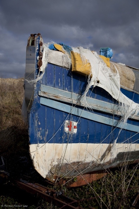
A couple of years ago we spent the weekend at Climping, near Littlehampton in West Sussex. On the west bank of the Arun at Littlehampton we found this old RNLI (Royal National Lifeboat Institution) lifeboat, gently rotting on the shore. I have always been interested in the story of the lifeboats and their crew. If you’re not from the UK, you may not know about this organisation staffed entirely by volunteers who freely give their time and risk their lives to save those in peril on the sea. The bravery of these men and women over the centuries is remarkable. I can’t believe no-one has made a blockbuster movie about them yet. I wonder what stories this boat could tell if it could speak.

I thought that this tree tunnel at Pagham Harbour in West Sussex had a slightly fairy tale feel. When I edited the shot I was inspired by Jean Cocteau’s iconic film, La Belle et la Bête (1946). I wanted to create a black and white that captured something of the aesthetic of the film. It was just an experiment but fun to do.
Have you ever taken or edited a photo inspired by a favourite movie?
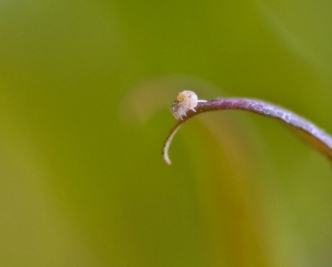
A tiny spider pauses…
…before parachuting away on a strand of silk.

