Still Autumn, just…

Weybridge

f/11, 1/25, ISO 100, 16mm, circ. polariser

There is a heavy hint of change in the air.  The trees no longer bask in full Autumn glory. Instead, their leaves billow under the wheels of passing vehicles.  Twice this week my day has begun with scraping frost from car windows.  Staying out to photograph the sunset, my hands and feet became numb from the cold.

Weybridge

f/11, 1/15, ISO100, 16mm, circ. polariser

Perhaps in sympathy, it’s been all change in my digital life this week.  I have finally downloaded Photoshop Creative Cloud and Lightroom 5.  For photographers there’s a special subscription deal for just under £9 a month.  That’s a huge discount, but hurry, it ends on 2nd December. It will take me a while to get to grips with Lightroom as I haven’t used it before but PS CC seems fairly intuitive, not too much of a leap from CS4.

One of the things that’s much improved from CS4 is the HDR facility.  The image below is my first attempt.  Just three exposures blended by PS CC.  It’s certainly light years ahead of what CS4 would have produced but I’m still not sure about it.  I had to tweak a lot to get it to look even vaguely natural.  Perhaps it’s a good thing I have ordered some ND graduated filters so I can do it in camera instead!

Weybridge

f/16, 1/6, ISO 100, 16mm, circ. polariser

Just to make life even harder, I also upgraded my iMac operating system from Snow Leopard to Mavericks.  It seems mostly familiar but for some inexplicable reason I now have to scroll in the opposite direction.  Mighty confusing!  There’s probably a setting I need to tick somewhere.  (Scratches head bemusedly.)  

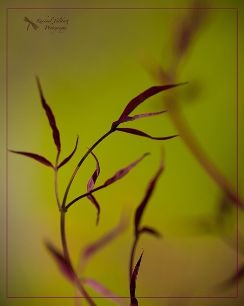
And, just to add to it all, I have finally given up on Redbubble and am working on creating a new website with Photium.  More on that soon.  In the meantime, I hope you enjoy these further images from my walk last week along the Wey Navigation towpath.

Watermarks: how to and should you?

20120512-102531.jpg

Some of my eagle-eyed readers have noticed that I have recently started to add a watermark to some of my images. I thought I would share how I have done this and then ask whether I should have done it at all.

20120512-102753.jpg

I drew my logo with black pen on white paper and photographed it. In photoshop (I use CS4), I adjusted the exposure to get a true black and true white and then inverted the image, so now I had a white dragonfly on a black background. Then I added the type and the ‘C’ in a new layer and, hey presto, one logo.

20120512-103050.jpg

Or two logos – I can’t decide which I like better.

To insert into an image, I copy and paste the logo onto the image and then select screen from the drop down menu of layer modes. This ignores the black background and just adds the white. Then I adjust the opacity slider to get a watermark effect.

In the top image, I have coloured the watermark to suit the subject. This is easily done simply by using the paint bucket tool and clicking on the white areas of the logo before you add it to your image. If you choose a dark colour, you may find it works better to invert the logo (back to black on white) before changing the colour by clicking on the black writing and picture and then use multiply as your blending mode, thus losing the white background and pasting only the dark letters.

Well, I like my pretty little logos and I had a lot of fun designing them. I was influenced by a couple of friends who have very stylish logos that always look great. See Modern Memory Keeping for a great example. But when I add my shiny new watermarks to my images I feel frustrated as they often seem to me to spoil the look. It’s not too bad in an image like the one at the top, which is as much about design and presentation as the photograph alone, but I have no doubt at all that a watermark would spoil, for me, an image like this:

20120512-104012.jpg

How important is it to add a watermark when sharing images on the web? Does it really offer a practical protection from image misuse? It does perhaps make sure your shot is attributed to you when reposted by people too lazy to attribute properly. But if you want to stop others from deliberately poaching your work, a little watermark in the margin, so very easily cloned away, isn’t going to help you. You need a dirty great watermark marching right across the middle of your cherished image, thus spoiling its appearance utterly.

What do you think?