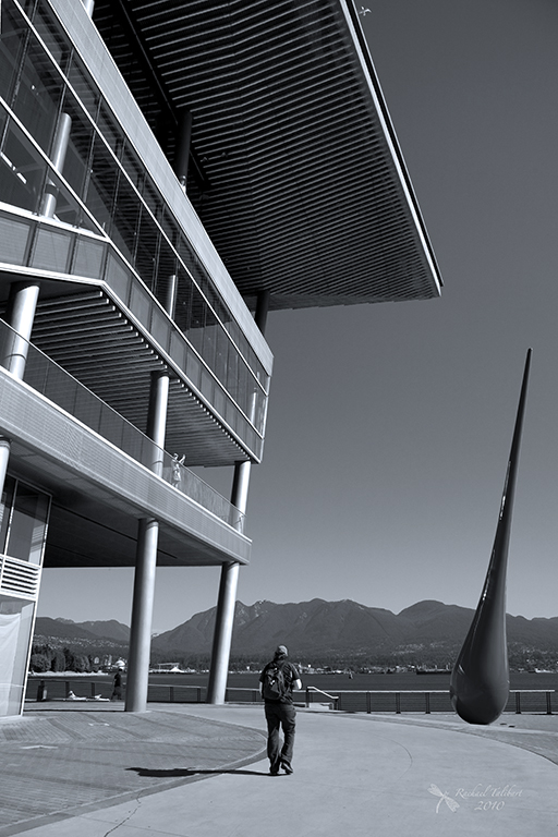
As a respite from the bug macros, I thought I’d pay a visit to one of my favourite North American cities, Vancouver.
I thoroughly enjoyed prowling round the most modern parts of this city, playing with angles and snapping details that caught my eye.
I often convert my shots of architecture to black and white to bring out the interesting shapes and patterns.
It can be fun to zoom in tight.
Or pull back for a wider view.
Sorting out converging lines can be tricky with tall buildings but sometimes it’s fun not to bother…
…or to go mad:
Reflections are always a lot of fun.
I did allow some colour, sometimes a lot of colour:
I hope you enjoyed my architectural safari. Vancouver really is a super city and there is, of course, much more to it than its modern architecture. More another time. I will leave you now with this thought: what’s not to like about a city that has a giant lego orca?


I liked the way you used the black and white to concentrate our vision on the lines and geometry of the photographs.
Thanks. 🙂
I do love the Canadians. There were years I thought I’d have to migrate north to get away from the insanity down here 😉
I like them so much I married one 🙂
Great plan! Wish I’d thought of that. Instead I ended up with an Oregonian…. not a bad second choice… 😉
Not bad at all! 😉
Great photos, I especially like the black and whites. I’ll be making my first visit to Vancouver in April and can’t wait!
Oh, lucky you. I have no doubt you will love it.
Amazing photos! The lines are fantastic. They draw you in to each one. The black and white just tops it all off. Brilliant!
Thanks, Jaina. You will have to go there one day!
I’ve aways wanted to visit Vancouver, until I get around to affording it I’ll use the photos as a lovely reminder why I shouldn’t give up my dream of going.
There’s plenty of time – it’s not going anywhere 😉
Enjoyed seeing some B & W on your site, Rachael, and another side to a city I liked when I saw it in 1993 – God, so long ago. In fact the side we saw (then-GF and I) was, we came to realise, Skid Row. Not much modernist architecture down there, back then anyway. My other lasting impression is that it was COLD, for we Australians anyway.
I empathise re your converging-lines dilemmas. Sometimes I think, after several readjustments, that the photographer is far more sensitive to them than the casual viewer – and that I may be going cross-eyed.
We had last been there in 1994 and we noticed a huge change between then and our return trip in 2010. The area between the Harbour Centre and Stanley Park was barely recognisable.
Wow! Too much to say for a decent short comment box. My favorites for sure: 1) the pentaptych (is that what it’s called? the BEST!), 2) reflection Fairmont (love the portrait panorama) and, 3) the leaning building (very cool landmark, though the pixilated Orca IS pretty awesome). Rachael, you have done some nice work here with your eye for architecture! Never been to Vancouver. Great city for snapping photos. Thanks for sharing!
Hi Shannon. I think it would be hard not to like Vancouver. I must do another post some time about some of the other areas of the city.
Rachael these are magnificent.. I love when you put down your macro lens and give us a treat like this..
Thanks, Helen. With kids in tow, I don’t often get to do this sort of photography so I make the most of it when the opportunity presents itself.