
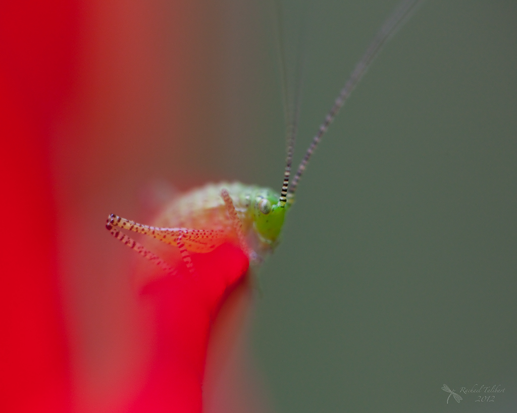
I like this slightly arty shot of a cricket in my garden. I like the way the cricket barely emerges from its environment. But which version of the image do you like best? The cool-colour version above. Or the warmer version below.

Or the minimal black and white?


black and white for me, although I think it could be even better if you darkened the shadows just a tiny smidgen more for deeper blacks in his eyes and spots.
Thank you. I might play with the black and white some more…
would love to see what comes of it.
I prefer the original. Perhaps the black and white one could do with a bit more contrast? It feels a bit flat.
Thanks, Jaina. Yes, it is perhaps a little plain.
I love the first one, I love that red!
Thanks. That’s my favourite too.
I go for the first colour shot. Most realistic. The red is a bit too burnt out on the 2nd one. Good shot too.
Thank you. I agree!
Yes, I think the first. You can drive yourself mad with these kinds of dilemmas, can’t you? Mine usually occur even before editing, with narrowing the list down to one from a series of a dozen or so almost-identical shots. I’m trying to be more ruthless with in-camera culling before I get home to save stress, and even taking just a single shot and hoping for the best!
One of my friends has suggested I go back to film for while. Perhaps they were dismayed by the volume of images clogging up my hard drive. Looks like we have a similar problem. 😉
I prefer the natural contrast and color of the first, Rachael, but the black and white is also fun – I like how it shows off the cricket’s ‘freckles.’ 🙂
Thank you, Tricia. I may tinker with the black and white one at some point. Funnily enough, the middle one is actually the as-shot. I recently read a blog that suggested switching the WB to cloudy in camera. It seemed to improve their shots but I must say I found it a little too warm for this particular image.